Being digital means always being in a dynamic state. The shifts in the technology are swift and you should also be ready to learn quick or else perish. The punishment for lagging behind can be brutal for companies as is evident in IT history. In web designing the spirit is to keep pace with the new trends so that you can always deliver the cutting-edge to your clients.
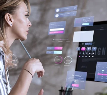
Today’s websites demand that information flows consistently with focus on openness and crisp clear style. People love websites that deliver more with little effort. However, what may seem simple on the the outside requires serious effort on the inside. Conceiving a website requires that you learn 2018’s latest trends and apply them in your projects. With all that in mind, let’s explore what 2018 has offered to us web designers so far.
-
Color shadows and depth
There is nothing new about using shadows and depths. But today’s variations will make yesterday’s shadows seem prehistoric. The parallax layouts and grids, you can apply a host of shadow types to create the perfect illusion on the screen. Compare this to the flat design trend that has gained popularity in the recent years.
-
Vibrant color schemes
2018 has seen an explosion of sorts in terms of color scheming. Some may even say it’s getting out of hands. Now, super-saturation and richer colors are making websites a whole lot natural. Header shades and vibrant color scheming can be seen on top websites. Hard angles, contrasting colors and lively slashes are all the rage. Try to create a branding image that integrates coloring scheme right from the start.
-
Particle background
These are the perfect solution to website performance issues plagued by video integration problems. These light-weight animations helps give a dynamic movement look without putting on too much load on the website. These light yet easy-to-apply backgrounds can help attract the user’s attention immediately. These can also be used to divert attention on content heavy pages. Their eye-popping designs can be too trends sometimes. Thus, they should be applied with caution keeping in mind not to overstep boundaries.
-
Mobile still rules
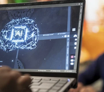
Mobile design is here to stay for long. It has been the case for past 3 years. But in 2018, mobile design has matured significantly. The burger-menu is now the quintessential menu for all the websites helping them save space and de-clutter. Flat icons also are important. With upcoming improvements in AI, you can now easily fix UI and UX issues. Take good care of user feedback in case of mobile websites since they are a major source of conversion.
-
Custom Illustrations
In order to create friendly, playful and easy-to-use website, illustrations are a must. Good artists, (read web designers!), try to use custom-made illustrations that are tailored to the specific brand’s needs. With markets becoming crowded every year, every brand vouches for more space and illustrations are the perfect way to stand out.
-
Typography gets bolder
It’s strange but typography is getting bolder and bigger each passing day. It is a powerful visual tool to make quick impact on the customer as soon as they land on the website. Good text and font can evoke the right emotions while simultaneously conveying key information. Almost all the devices today offer good resolutions. So, there is no excuse to using sharper fonts and beautiful typography. Try to work on the content regularly to keep the website updated. Automatic CSS enabling will further make the task easier. Contrasting sans serif, large letters, serif headers all come together to offer the best UX experience.
-
Asymmetric layouts
Broken or asymmetrical layouts have taken over in 2017 and now continuing in 2018. The appeal of such a layout lies in its distinctive and unique presentation. The same page now seems much more information filled. Traditional grid-based structures are still popular but image heavy websites now prefer asymmetric layouts more. It is a little risky but still sometimes out-of-box strategy can do wonders to an otherwise pale website.
-
Dynamic Gradients
Flat design is something that is refusing to go away. But gradients are being revived big time in 2018. Subtle shading to the icons is the perfect use for gradients. But this time around, you can go for photo gradient filter that helps increase the image’s appeal. If you are short of good images, you can always create a simple gradient background that goes with the current color scheme.
Trends change faster that you can imagine. It can be tough to keep pace with them. From bold gradients to bright colors, you can always choose what suits you. What is important is that you follow the common ones so that you are in the game. As far as experimenting is concerned, sky is the limit! You’ll be surprised to see what designers can do with a little imagination.
At CitrusStudio, we help our clients stand out from the crowd with simple yet powerful web designing strategies. We believe the right web design can significantly propel your branding efforts. Let us help your business keep pace with the changing times by implementing 2018’s best web design strategies.